
Wearing three bright colors in the same outfit remains an exercise that most fashion guides avoid. As soon as a third saturated color comes into play, the question goes beyond the simple color wheel: it concerns the distribution of volumes, proximity to the face, and the cut of the pieces.
Bright color near the face: the starting point of the entire palette
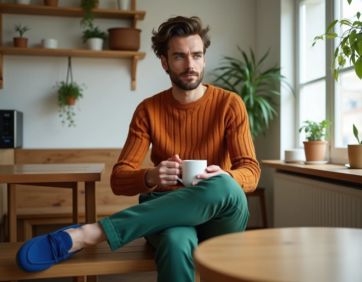
When associating three saturated shades, the one closest to the face dictates the overall perception of the look. A fuchsia top, an orange turtleneck, or a bright yellow scarf alters the reading of the complexion, dark circles, and skin tone. The other two colors, worn on the bottom or as accessories, play a secondary role in this interaction.
Read also : How to Create a Facebook Messenger Poll for Your Business?
The common reflex is to choose three colors from the color wheel and then distribute them randomly. This approach ignores a crucial parameter: the color worn near the face directly influences the complexion. An orangey red warms a golden skin tone but can harden a light complexion with cool undertones. An electric purple, on the other hand, flatters cool skin tones and creates an interesting contrast with dark hair.
Starting from the top rather than an abstract palette allows for building a combination of 3 colors on Maison de Mode that takes the wearer into account, not just the theoretical scheme. The practical rule: test the piece closest to the face in natural light before adding the other two shades.
You may also like : How to Choose the Best Electric Lawn Mower for a Impeccable Garden
Distribution of color volumes in a three-tone outfit

Three bright colors worn in equal parts create a carnival costume effect. One of the three shades must occupy the majority of the visible surface, with the other two appearing in more restricted areas. This principle of dominant, secondary, and accent is not new, but it takes on particular importance when no neutral color calms the whole.
The dominant color covers the largest visual block: wide pants, a dress, a coat. The secondary appears on a medium-sized piece (top, short jacket). The accent is limited to an accessory or detail (bag, shoes, belt).
Proportions that work with saturated colors
- Dominant on the lower body (pants, midi skirt) if the most intense color is also the darkest of the trio, as the visual weight remains anchored
- Secondary on the top, by choosing the shade that best complements the complexion according to the natural light test described above
- Accent limited to a single small-surface piece, never spread over multiple accessories, to avoid a patchwork effect
This hierarchy does not prevent reversing the positions. An emerald green coat worn over a coral top with a saffron yellow bag works because the coat, as the largest surface, stabilizes the reading. Three bright colors of equal surface tire the eye in a few seconds.
Structured cut and bright colors: why silhouette changes everything
Recent fashion content emphasizes a point that color guides ignore: the cut of the garments moderates or amplifies the intensity of colors. A fluid and loose fabric in a neon shade gives a very different result from the same color on a fitted piece with sharp lines.
With three saturated colors, a structured silhouette contains the visual energy. A straight blazer, cigarette pants, or a pencil skirt impose geometric lines that frame the color. The eye is drawn to the shapes before perceiving the palette. In contrast, three oversized pieces in bright shades dissolve the silhouette and produce a costume effect.
Adapting the color trio to the occasion
A maximalist three-color look is not worn the same way at the office and in the evening. The difference does not lie in the choice of shades, but in the structure of the pieces and the amount of skin visible.
- In a professional context, the dominant can be tailored pants in a bright but dark color (cobalt blue, intense forest green), with a top in a lighter shade and an accessory in the third color
- In a festive context, the proportion is reversed: one can increase the saturation on the top and reduce the surface of the dominant (crop top, bralette) so that the three colors are readable without overwhelming
- Outdoors or on vacation, light materials and relaxed cuts better tolerate very saturated trios, as natural light softens contrasts
The common point between these contexts: at least one structured piece in the trio to anchor the silhouette. Even a colored straight jean fulfills this function.
Color trios that pose problems and those that hold
Not all combinations of three saturated colors are equal. Some create an unpleasant optical vibration, especially when two of the three shades are close in brightness and temperature without being strictly analogous.
The classic case: bright red, bright orange, and fuchsia pink worn together. The three share a warm base and comparable saturation. The eye finds no rest because no shade creates sufficient contrast with the others. An effective trio mixes at least one warm color and one cool color, even if all three are bright.
The trios that hold up have a logic of internal contrast. Lemon yellow, purple, and emerald green work because each color occupies a different area of the spectrum. Fuchsia, Klein blue, and mango orange create visual tension, but the temperature gap between the cool blue and the two warm tones gives a reference point for the eye.
The pink-red duo worn with a third bright color divides opinions: some stylists consider it a contemporary classic, while others find it messy as soon as a third saturated tone is added. The exact saturation of each piece and the texture of the fabric alter the result so much that only a fitting can decide.
Testing a trio by photographing oneself full-length in daylight remains the most reliable way to decide before going out. A functioning trio is readable at a glance from three meters away: if the colors blend or create a blur, it means the internal contrast is lacking.